3D game asset
Space Crate
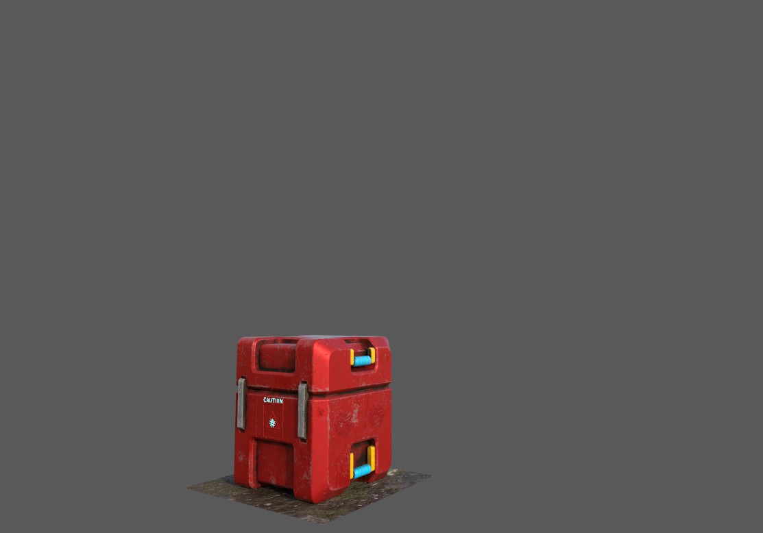
A 3D game asset created in Maya and Substance Painter to communicate sci-fi function, durable materiality, and environmental readability.
Project file Space Crate
Maya model · Substance Painter texture · sci-fi prop · game environment asset
3D game asset
A 3D game asset created in Maya and Substance Painter to communicate sci-fi function, durable materiality, and environmental readability.
My Role + Duration
Built the hard-surface crate form with panels, bevels, and a readable sci-fi storage silhouette.
Painted material contrast, color blocking, and surface wear to communicate durability and use.
Evaluated the asset as an object that could support storage, cover, or set dressing in a game environment.
Completed as a 2024 project focused on 3D asset production.
Project Overview
Space Crate is a hard-surface prop study for a sci-fi game environment. The object needed to read as functional storage while also showing material contrast, wear, and production quality.
The product is a finished render supported by design rationale around silhouette, paneling, surface detail, and game-world use.
Problem + Goals
Game props must communicate purpose quickly from different distances. A crate that lacks a clear silhouette, material contrast, or surface logic can disappear into the environment.
Create a recognizable sci-fi storage silhouette.
Use paneling and wear to communicate scale and material history.
Present the asset through a finished render that shows production craft.
Research Plan
Evaluation focused on checklist-based asset review: silhouette, panel hierarchy, material separation, and render clarity.
Qualitative review emphasized that believable props need both clean form and surface history; texture should support the object rather than decorate it randomly.
Findings
"The shape reads as a sci-fi crate right away."
"The surface wear makes it feel handled instead of new."
"I would want to see a turntable or wireframe next."
The strongest direction was to make the crate readable from silhouette first, then use texture and wear to explain material history.
Personas + Empathy Map
Persona 01
Needs a prop that can sit believably inside a larger sci-fi scene.
Persona 02
Needs the object to read quickly as storage, cover, or set dressing during play.
What is this object used for?
The surface should tell me something about the world.
Scans silhouette first, then checks panel and material detail.
Interested, analytical, and attentive to craft.
Insights & Opportunities
The overall shape must communicate function before small texture details matter.
Surface marks are most convincing when they appear in places where use would happen.
A stronger asset page would include additional angles, wireframes, and material views.
Proposed Solutions
Keep the crate blocky, modular, and recognizable from a distance.
Use bevels, inset forms, and color blocks to clarify structure.
Place wear where the object would be handled or exposed.
Add turntable, wireframe, and in-engine lighting tests in a future version.
Define prop role -> Model hard-surface form -> Paint materials -> Render asset -> Review game-world fit
Reflection + Lessons Learned
Space Crate taught me that game objects carry usability information through form, not only through visual style.
The strongest lesson was that asset production depends on layered clarity: silhouette, panel structure, material contrast, surface wear, and final presentation all affect how the object is read.
In a future version, I would add wireframes, UV layout evidence, and in-engine lighting tests so the asset can be evaluated more completely.